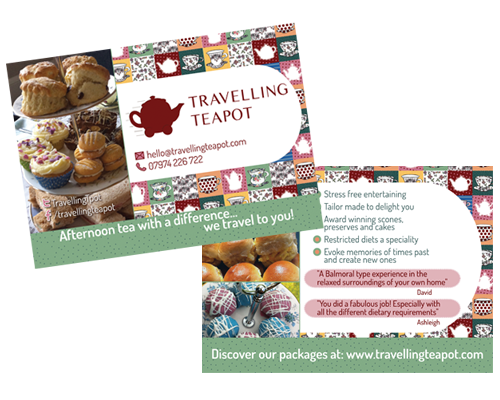
Flyer for Travelling Teapot

The message: How to craft the content & look of your marketing materials to achieve the best results.

“Communication is about what they hear, not what you say.”

That was my teacher’s favourite motto, saying that no matter how hard you try to say something the only point of view that really counts is the recipient’s.
A marketing campaign, a leaflet, a flyer or a banner, whatever media your small business is using, it’s there to deliver a message to your target audience.

Sometimes you want to tell them that you have just opened up or that you have a sales offer on. But most of the time you are simply delivering your company’s message: You are shouting “We are here and we are the best because – INSERT YOUR USP HERE (Find out more about USP – Unique selling point – Here).

At Guizzo, we guide you through a process to collect all the information we need to tailor the perfect message for your marketing communication, not only in terms of design, but also regarding your content and tone of voice.

We never take your content and “just make it pretty”, we make sure it gets your message across as well.
We believe there should be no marketing material without a clear message that is in line with your business and your values.


If you are working with us then you are on the safe side. If not (too bad!) here are a few tips on how to craft your message and brief your designer:

First question to ask yourself is: WHAT DO I WANT TO SAY?

Then: WHO AM I SPEAKING TO? Is the tone I’ve chosen appropriate for them?

Next question to answer is: FURTHER INFORMATION DOES MY TARGET AUDIENCE NEED to follow my call to action?
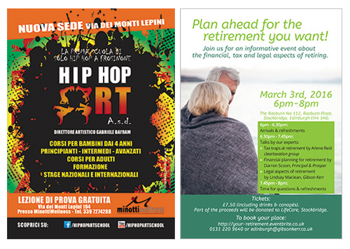
GUIZZO_HipHopArt+GibsonKerr_FLYERS Once these questions are answered, you are ready to write your text.
Measure and tailor the words so they are appropriate for the medium you are using (don’t stuff thousands of words into a flyer; don’t forget contact details on an advertising space; only put a handful of carefully chosen words in an online banner).

And last but not least think of fonts, colours, images and whatever takes your fancy: Your designer will guide you in choosing the right design elements to strengthen your message and attract the right audience.

Finally, when your layout is ready, don’t forget to step back and… be a stranger for a minute!

Guizzo's tips for local market stalls

Local Markets: How to make your business stand out

At Guizzo  we are passionate about food, craft and makers’ markets, in fact we have been stall holders for quite a good time, although just during the weekends.
We know how at markets you need to face the weather, to withstand the increase/decrease of the amount of business in different months, and to stand out among dozens of fellow traders, often while staying underneath the very same gazebo as anyone else.

Can a designer help with this? We can do much, we believe, but we will start with just a few tips:

Florist stall at the Stockbridge Market.
Make your stall look different from any other :

Do not underestimate the power of a nice drape or tablecloth or bunting in your corporate colour: these will draw people looking for you to the right stall even from far away.

Get your branding and display right

Make sure your banner, business cards, flyers, boards and leaflets look the same and make a coherent image of your company. Make an effort to display your products in a good looking and original way, with packaging display material: you don’t have to buy it all, check on Pinterest for some cheap and new ideas and give craft a go!
All of this contributes to your overall look, and makes people memorise your business.

Fresh produce at St. Mary’s Market
Make sure you are easy to find

Your contacts and social media details should be clearly displayed and memorable, don’t just display social media icons, without a comprehensible link.
Build an internet presence: even the simplest website, with the right branding and contacts can go a long way, increasing the “out of the market business” and letting people know what markets you will attend and when.

Can we help?

If you want to know more about what we can do for you, book a free and relaxed consultation, or be surprised with our friendly design prices, please contact us.

Practical Guide To Design FOR CLIENTS

How to TELL a PROFESSIONAL FROM an AMATEUR DESIGNER by looking at his work

I firmly believe that everyone has the natural ability to recognise a balanced design project that works well (no matter if this is a logo, a leaflet or a website) from an unclear, messy, amateur one.

At home in Edinburgh, flyer for Festival Property Owners.

Just… some people will analyse what they are looking at, and be able to tell what puts them off about it, while others will just have a general negative feeling by mere instinct.

If you are part of this second category of people, especially if you need to hire a designer every now and then, here is a guide for you to get a clearer view of what that negative feeling is generated by, and make you able to recognise a professionally designed product when you are looking for someone to design your new website.


Look for space and margins

A professional designer cannot be scared of empty spaces, they are necessary for readability and style. If the product you are looking at is cluttered with borders, backgrounds and unnecessary images then, it’s a scam!  

Fonts

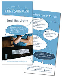
Sandstonecastles Marketing, corporate flyer.

Beware of designs which use more than three different fonts; fonts are an important choice for a project, if there are too many, that choice has probably not been made at all. Must of all: BEWARE OF COMIC SANS!!

Colours

Colours transmit feelings, so there are appropriate and inappropriate colours for different kinds of products. You wouldn’t make a funeral director sign in pink, or a tanning studio one in freezing cold grey, would you? Also, whatever the project is, colours need to reflect the owner’s company brand. For example if your logo is blue and orange, your leaflet and website should have those as leading colours, in the very same shade, so that your customers will recognise your company and create mental connections.

Images

Beware of text sitting right on pictures, so that the picture is spoiled and in many cases the text cannot be clearly read.
Finally a professional designer will never ever stretch a picture without respecting proportions.
If you see that what you are looking at has squashed all the people so that they look like Snow-White’s dwarves, or that the moon is not round any more, but has turned into an egg, well… Just drop in the bin!